A Single Place for Your BTMCommerce
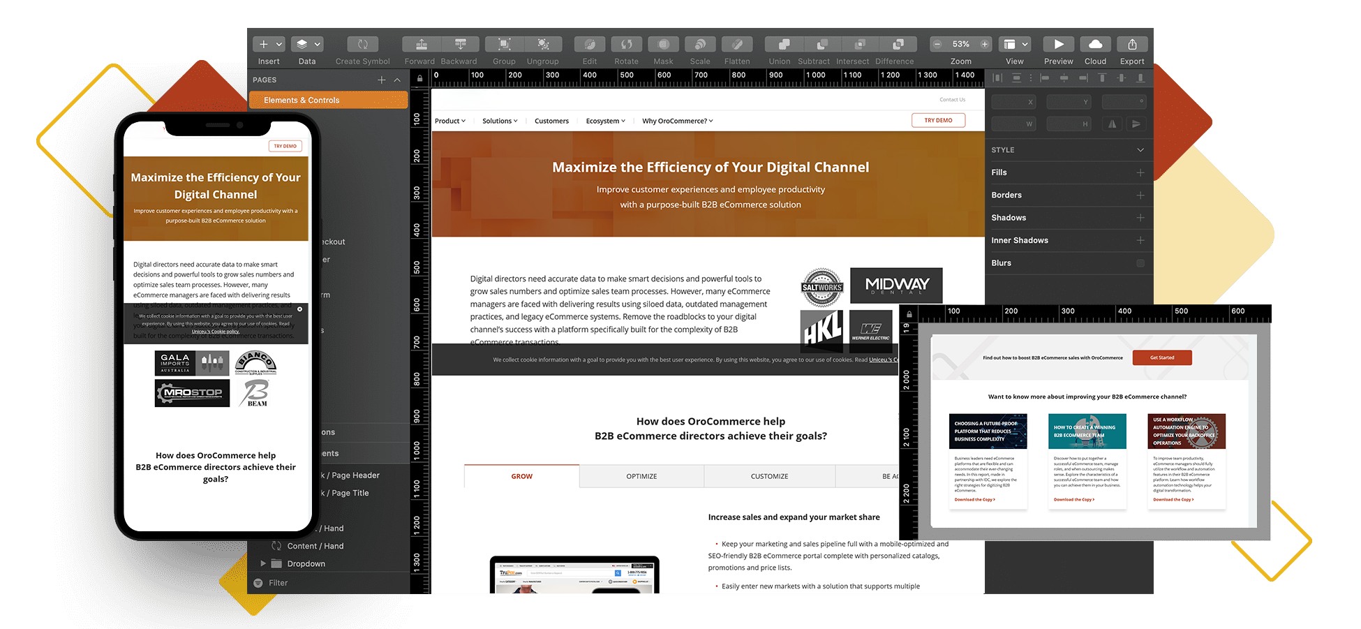
Design Elements

Whether you’re just getting into the design of your eCommerce site or want to improve your existing design workflow, we’ve got everything you need to create high-quality work.
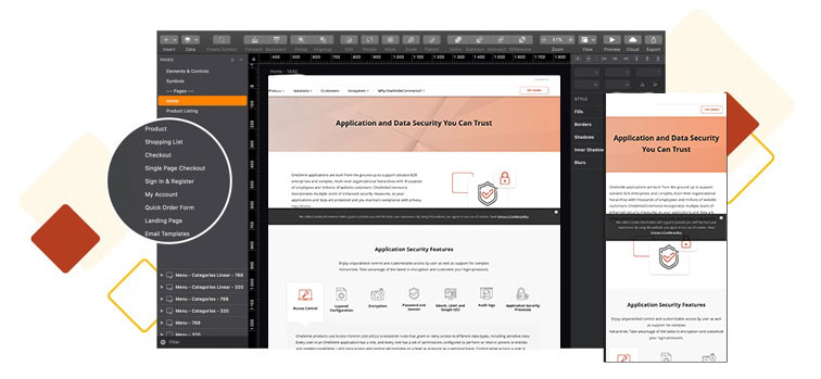
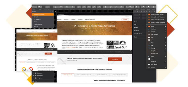
Utilize a library of BTMCommerce’s own UI components that include interface elements, symbols, and correspond to desktop, tablet, and mobile screen resolutions.
BTMCommerce’s UI kit runs on Sketch. It features an array of vector editing tools, grids, fonts, styles, and reusable components that make designing truly effortless.
Keep your team on the same page with your designs. We’ve made the UI file easy to navigate with layers that correspond to all design elements (colors, typography), symbol usages, and pages.

Focus on creating designs instead of worrying about design elements. Start creating in no time with all the required design elements such as buttons, input fields, and more.
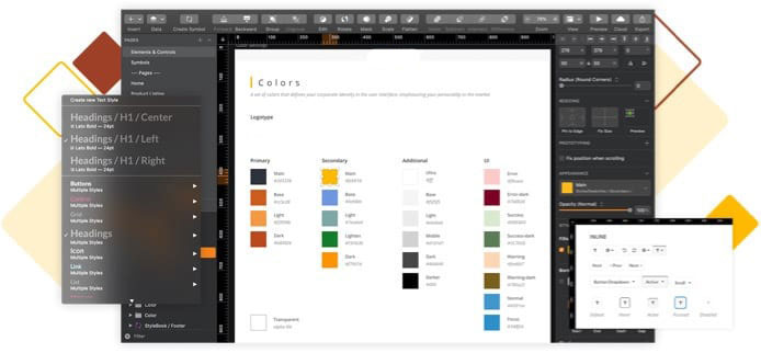
Colors bring your brand life and help you create an experience that’s pleasurable and memorable. With a color palette that ties into interface elements, managing colors is easy.
All BTMCommerce elements are at your fingertips, simplifying design management. Customize backgrounds, buttons, input fields, and more to match your brand.
Communicate your content through the style, structure, and presentation that resonates with your audience. Use the Typography Settings to get your styles in line with your brand identity.

Help out your designers, marketing teams and front-end developers. Keep all elements in one place and avoid searching, back-and-forth, and misplacing crucial design components.
Designers and illustrators are able to better convey brand and product values by referencing existing styles, and content managers can maintain typography in line with the brand’s image.
Marketers can maintain consistency, and deliver the same high-quality message every time. Marketing teams save time, keep focused, and enable a culture of improvement.
Front-end developers can keep track of design issues and make changes while the design is still in progress. Coordinating development with design is easy with the right elements at hand.

Save time during prototyping, designing, and get your creations out the door faster. Share and reuse your components between pages, designs, and teams.
Improve productivity and keep your designs consistent with styles that update all other elements using a particular style automatically.
Reuse components, share your styles, as well as collaborate on your designs using Sketch. You can even export your designs for use in other tools.
Don’t sacrifice quality as your workload increases. Work at scale effortlessly, regardless of the size of your team or the number of design projects.